Reports management
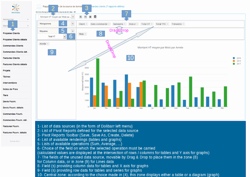
Reports list
The list of reports allows you to select the report to be displayed among the reports already created.
Reports toolbar

The report toolbar lets you manage the life cycle of a report.
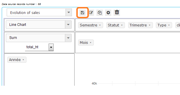
Save
The “Save” button is used to save changes to the report settings.
Rename
The “Rename” button is used to change the name of the report.
(“Rename” is a new feature and may not appear in some screen shots in this doc)
Save as
The “Save As” button allows you to make a copy of the definition of the currently displayed report and save it under another name.
New report
The “New Report” button is used to create a new report definition from the current data source.
Delete the report
The “Delete Report” button is used to delete the definition of the currently displayed report.
IMPORTANT: we are talking here about the definition of the report (title, column fields, line fields, operation, …) and not data from the report.
It is this definition that is saved / modified / deleted.
The data is updated each time the data source is selected (left menu).
If you want to keep track of the calculated data at time t, you will need to export it.
Create a new Report
Creating a new report is always done in the context of the selected data source (left menu).
In the following, for example, we will create a new report for the data source “Customer Invoices”.\
Here is the definition of our report:
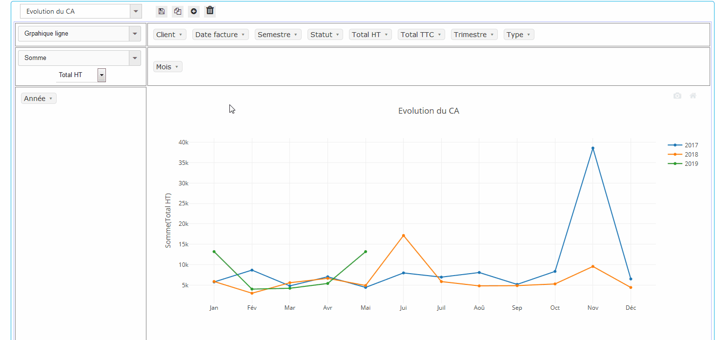
Title: “Evolution of sales”.
It is desired to present it in the form of a “Line chart”.
The “Months” on the X axis (horizontal)
The turnover on the Y axis (vertical).
Each year is represented by a different color line.
Calculation of the sales will be done with the “Total HT” of the invoices
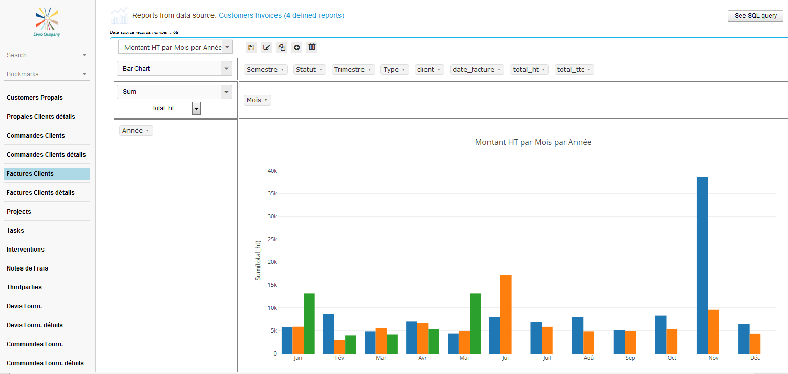
Step 1: Selecting the data source
In the left menu select the data source “Customer Invoices”.
This has the effect of displaying the 1st report in the list of already defined reports for this data source:
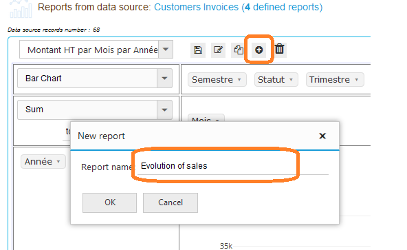
Step 2: Give a title to our new report
Our “Evolution of sales” report in a line chart is not yet defined, click on the “New Report” button and enter the title in the dialog that appears:
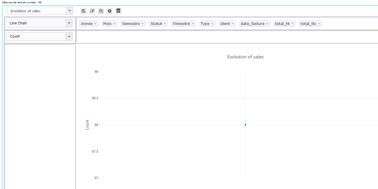
After validation of the title of the report, we obtain a completely empty report except the word “Totals” followed by the number of records in the data source:
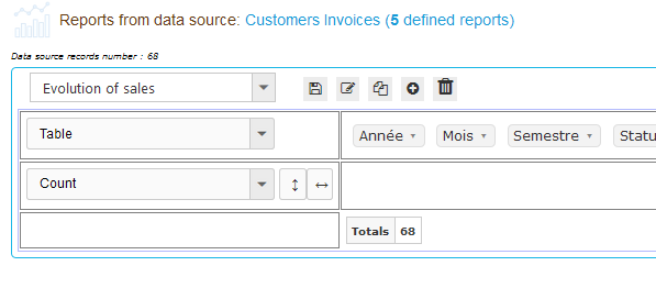
This is normal, the control Pivot has the data but does not know yet what to do with it, we will tell it in the following steps in the paragraphs below.
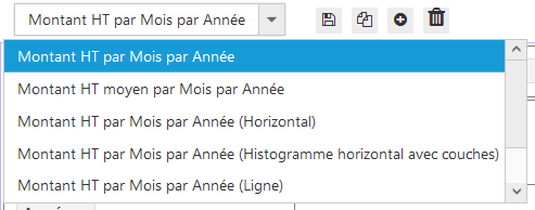
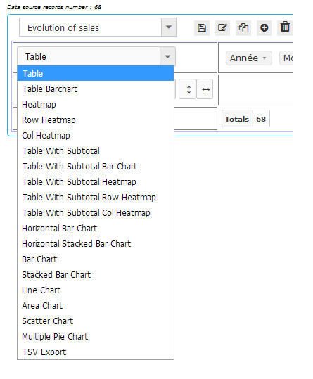
Choose report rendering type
The Pivot control is used to represent reports in tabular format or in charts format.
For both cases a certain number of report types are available in the combo just below the list of reports.
For our example “Evolution of sales”, let’s go to the next step.
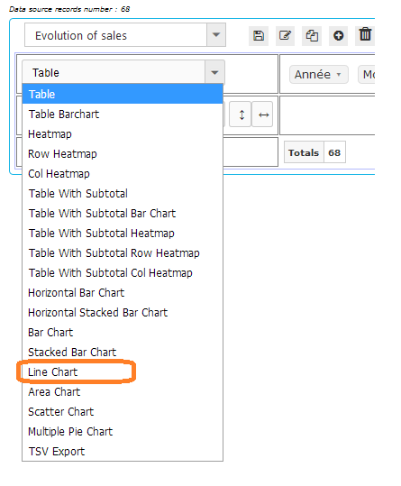
Step 3: Choose the “Chart line” type of rendering
In the list of types of rendering, select “Line Chart”:
Which gives us :
We already have our title that appears as well as some lines.
Now the Pivot control knows that it must draw a Chart line, but still does not know what to draw or how to do the computations.
Let’s move on to the next step.
Choose computing operation
Just below the combo box of rendering types is the combo box of available calculation operations:
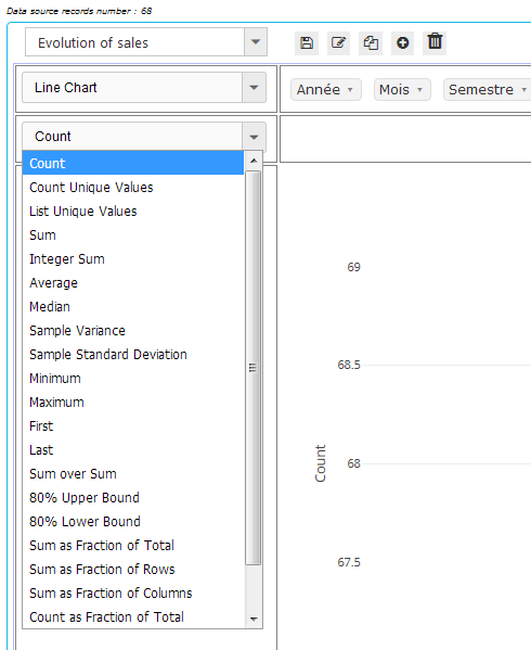
4th Step: Choosing the operation
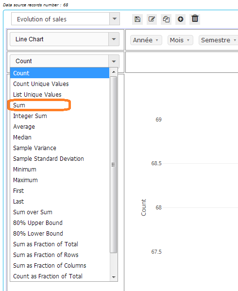
For our example, we want to trace the evolution of sales.
Well, the sales is a sum of amounts.
Our operation is therefore “Sum”.
Let’s select it:
Which gives us :
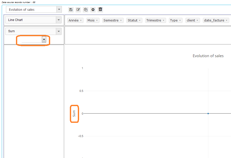
We notice 2 things:
First, the name of the operation that is displayed on the Y (vertical) axis.
Then a new Combo that appears below the combo of operations.
This is actually the list of fields in the data source.
The Pivot control simply asks us: You want to do the “Sum”, ok, but of what?
Which brings us to the next step in the paragraph below.
(To understand the origin of this list of fields, see the paragraph: Data source fields)
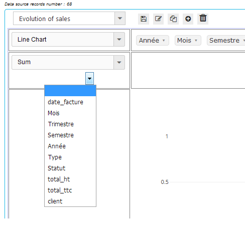
Choose operation field (or Y axis data provider field for Pivot charts)
After the choice of the operation, the Pivot control can display a combo of the list of fields of the data source, in order to choose the field on which the operation must carry.
For our example, let’s choose this field.
Step 5: Choosing the field on which the operation should be carried out
For the sales, it is the “Sum” of amounts.
We will choose the “total_ht” (Total tax. excl.) for our chart.
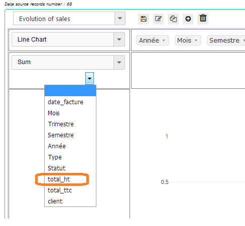
Which gives us :
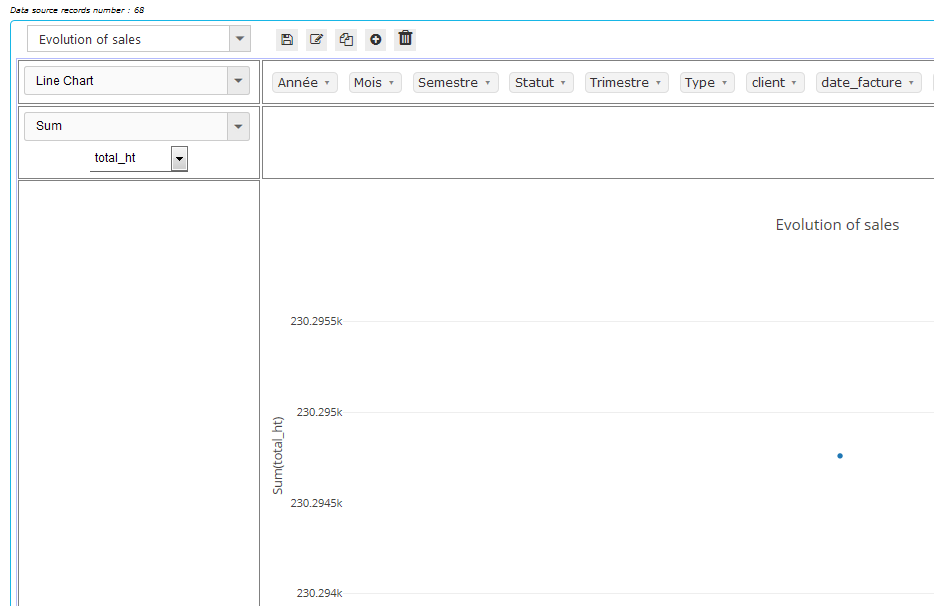
Now, the Pivot control knows that it must display the “Sum (total_ht)” on the Y axis, which represents the sales amounts.
Datasource fields
The data source provides a number of fields (for those who know the SQL language, these are the fields of “SELECT field1, field2, …”)
The Pivot control displays them aligned horizontally, in alphabetical order, at the top of its central part (or on the left vetically according to the parameterization of the Pivot Reports module).

In the above screeenshot, the fields come from the “Customer Invoices” data source.
This data source has been defined in the Admin part of the Pivot Reports module by an SQL query of the form:
“SELECT YEAR (t.datef) AS Année, llx_societe.nom AS Client, …”
And so the Pivot control takes the aliases of the field names and displays them as in the above screenshot.
PS. The same list of fields is displayed by the combo of the choice of the field on which the calculation must be carried out (see above).
Choose data provider field for X-axis (or column data provider field for tables)
To tell the control what data it should use on the X axis of the graph, simply drag & drop a field from the list of available fields to the location provided for this purpose:
(Click on image to play animation)
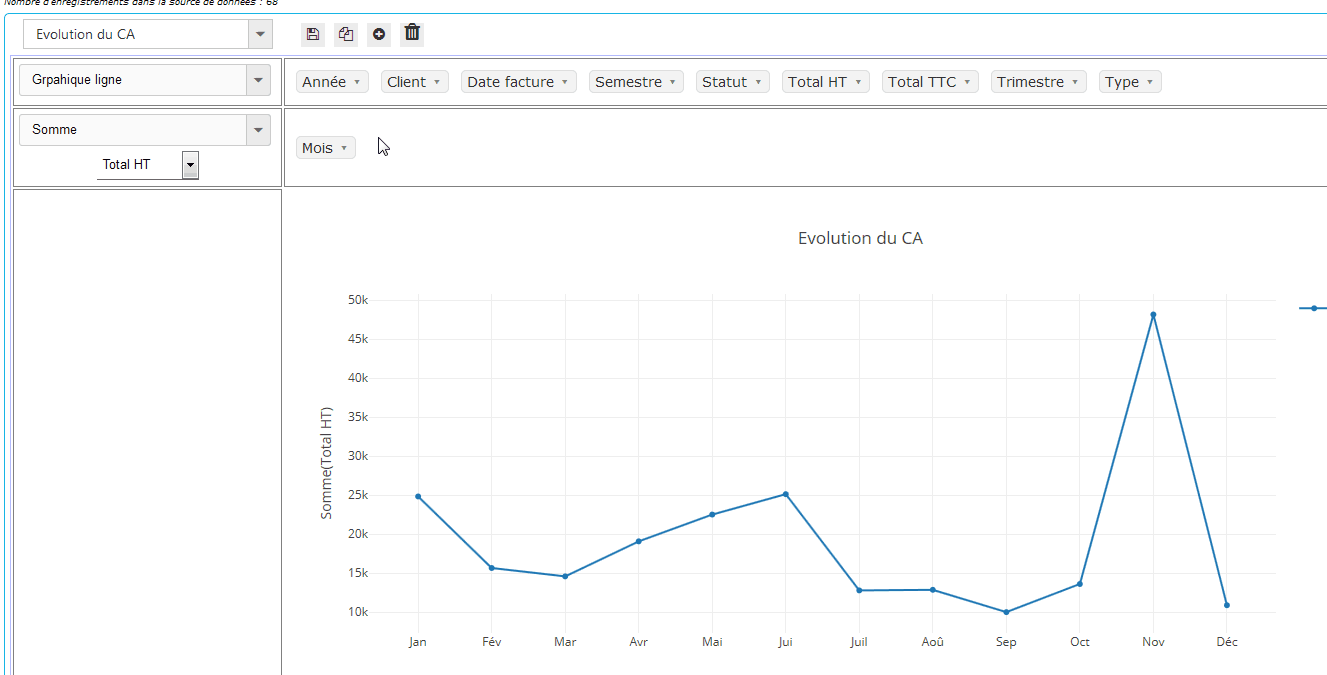
Above, we have chosen to display the months on the X axis.
6th Step: Choosing the X axis field
For our example “Evolution of sales”, we would like to see the evolution by Month.
it looks good, that’s what we did in the animation above.
Now the control has drawn a line representing the evolution of the sales but the years are mixed.
In the next step, we will separate the lines of the years.
Choose data provider field for Series (or rows data provider field for tables)
In the chart representation of the reports, it is often a question of representing several series of data in order to visually compare the evolution of the data of the series with respect to each other.
The Pivot control allows to choose the field of the data source which will provide the data of the series by simple Drag & Drop as shown in the following animation:
(Click on image to play animation)
7th Step: Choosing the field for the series
Our “Evolution of sales” report is almost finished.
It only remains to tell the Pivot control to draw the evolution of the sales separately for each year.
The result is visible in the animation above.
Step 8: Save our work
The definition of our report is now complete.
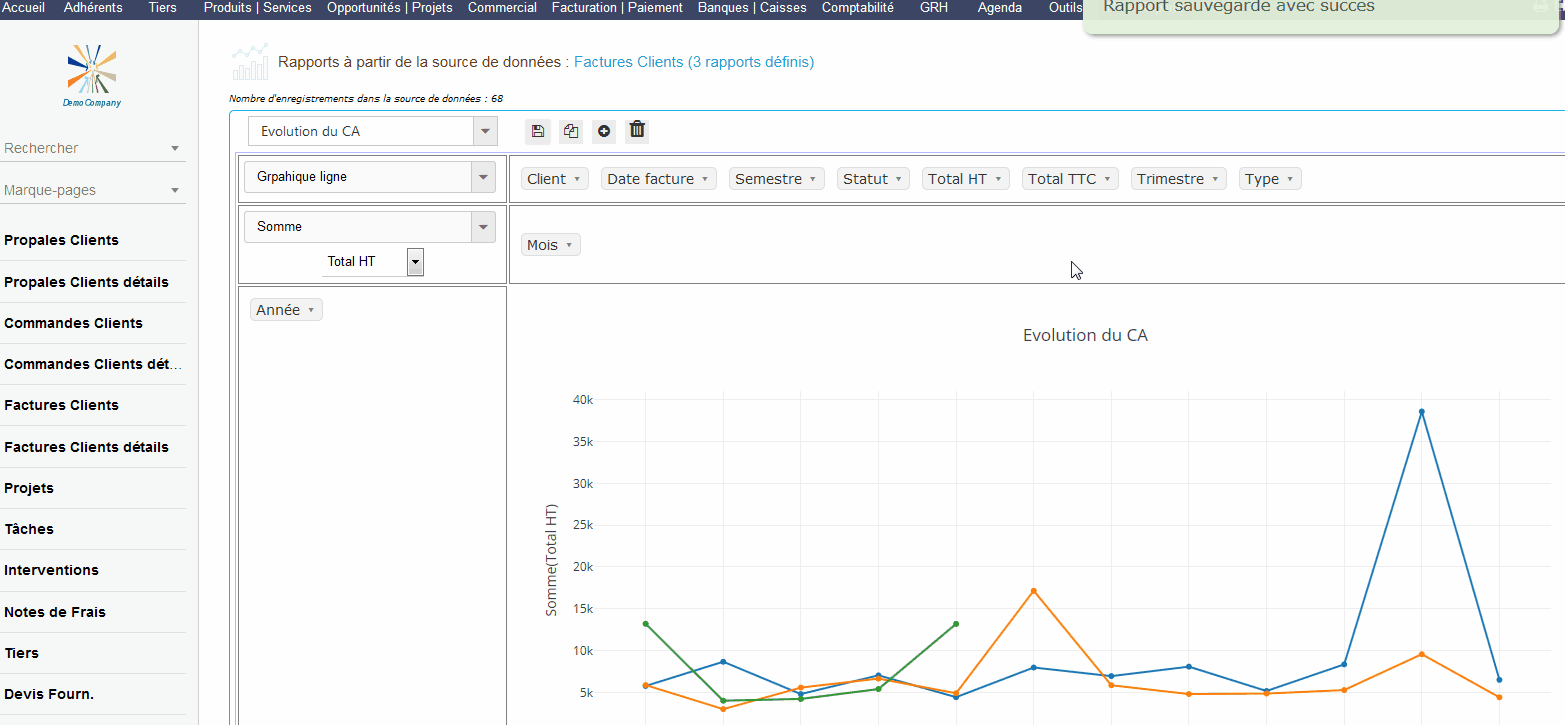
To be able to consult our report the next time without having to repeat these steps, we must save it by clicking on the button provided for this purpose:
Full animation of creating a new Pivot Report process
The following animation shows all the steps for creating a new Pivot report from an existing data source.
Here, we create the report “Evolution of sales” (per month per year) from the existing data source “Customer Invoices”.
(Click on image to play animation)
Data filtering
The Pivot control allows data filtering in the GUI.
Just click on the small arrow to the right of each field and deselect the data to exclude from the calculation.
For our example “Evolution of sales”, suppose that we do not want to take into account the invoices with the status “Draft” in the calculation of sales.
Just deselect this status in the “Status” field like this:
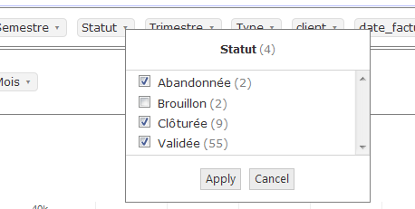
And click on “Apply”.
Then “Save” if you want to keep this setting for the next consultation.
In the interface, a filtered field would be italicized: