Pivot Charts features
Zoom on chart region
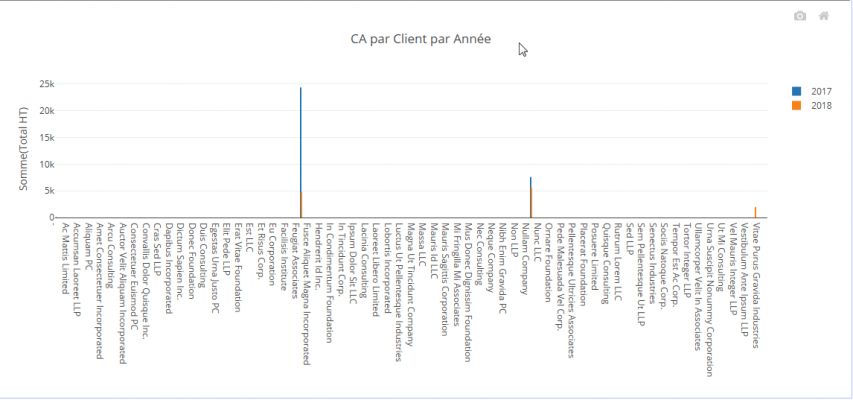
In the case the data is too condensed on the X axis and / or the Y axis of the graph, it is possible to enlarge a region of the graph to see more clearly.
To do this :
- point the mouse on the upper left corner of the area you want to enlarge
- press and hold the left mouse button while dragging the mouse to the lower right corner of the region to enlarge
- release the mouse button
- the selected region is then enlarged
To return to the normal size of the chart:
- Double-click anywhere on the graph
or
- Click on the "Home" icon that appears in the upper right corner of the graph when the mouse is on it
N.B. When the mouse cursor is on the graph, it changes to a "+" sign
Animation to show this process:
(Click on the image to see the animation)
Hide series
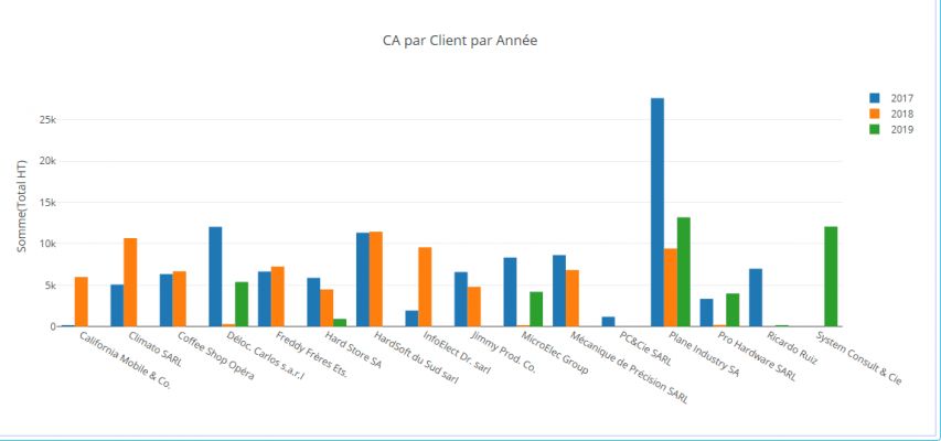
It is sometimes useful to temporarily hide a series of the Chart.
To do this, simply click on its legend.
To redisplay the series, click a second time on its legend.
Animation to show this process:
(Click on the image to see the animation)
Chart export
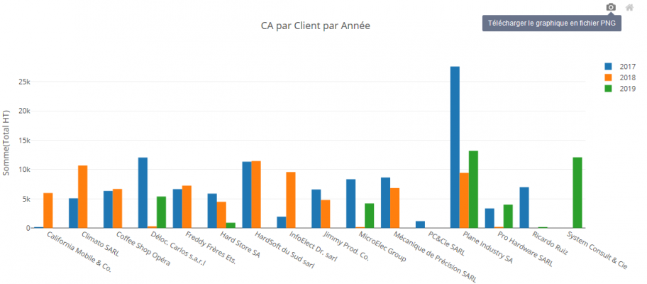
It is possible to export the Chart as PNG image format.
To do this, hover your mouse over the graph, a "Camera" icon will appear in the upper right corner of it.
When you click on this icon, the graphic image is generated and the browser offers to download it.
N.B. The generated image is identical to the graph as it is displayed at that time (taking into account zoom and possibly hidden series)


